1. line_chart( ) area_chart( )
    df1 = pd.read_csv('./data/lang_data.csv')

    column_list = df1.columns[ 1 : ]
    choice_list = st.multiselect('언어를 선택하세요.', column_list)

    if len(choice_list) != 0:
        df_choice = df1[choice_list]

        st.line_chart(df_choice)
        st.area_chart(df_choice)
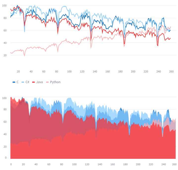

위의 차트가 line_chart
아래 차트가 area_chart 이며
인터랙티브 차트라서 줌인 줌아웃등
부분적으로 필요한 부분을 확대 축소하여 확인이 가능하다
2. Bar_chart( )
df2 = pd.read_csv('./data/iris.csv')
df_iris = df2.iloc[ : , : -2+1]
st.bar_chart(df_iris)
막대 그래프이며 위와 같이 확대 축소 또한 가능하다
3. map( )
        df3 = pd.read_csv('./data/location.csv',index_col = 0)
        st.map(df3)

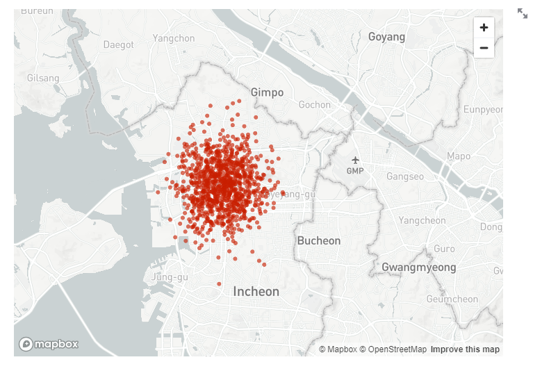
위도, 경도로 이루어진 데이터프레임을
지도로 표현해준다
앞서 말했듯이 확대/축소가 가능하다
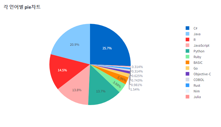
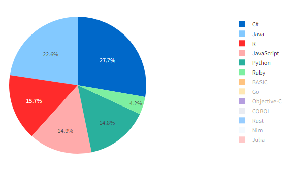
4. plotly_chart 의 px.pie( )
pip install plotly==5.21.0
설치가 우선적으로 필요하다
import plotly.express as px

df4= pd.read_csv('./data/prog_languages_data.csv',index_col= 0)
fig1 = px.pie(data_frame= df4, names='lang',values='Sum',title='각 언어별 pie차트')
st.plotly_chart(fig1)
임포트 후에
plotly_chart( )의 px.pie( ) 를 사용하여 그려주게 되며
pie( )의 파라미터 안에
name = 에는 pie차트에 표시할 조각을 나타내는 열의 이름을 표시하며
values = 에는 pie 차트 조각의 크기를 결정하는 값이 있는 열의 이름을 표시하게 된다
아래 그림과 같이 선택하여 차트에서 제거 할 수도 있다
5. Plotly_chart 의 px.bar( )
df_sorted = df4.sort_values('Sum')
fig2 = px.bar(data_frame= df_sorted, x='lang', y ='Sum')
st.plotly_chart(fig2)
막대그래프를 표시해주며
x축과 y축을 지정해줄 수 있다
'Streamlit' 카테고리의 다른 글
| 스트림릿 다운로드버튼 download_button( ) (0) | 2024.05.02 |
|---|---|
| Tensorflow - 딥러닝 모델 웹화면에 띄우기 (0) | 2024.04.29 |
| Streamlit - 차트그리기 plt.figure( ) st.pyplot( ) (0) | 2024.04.24 |
| Streamlit - 파일 분리 앱 (0) | 2024.04.24 |
| Streamlit - 사이드바, 유저에게 파일 받기 (0) | 2024.04.24 |


